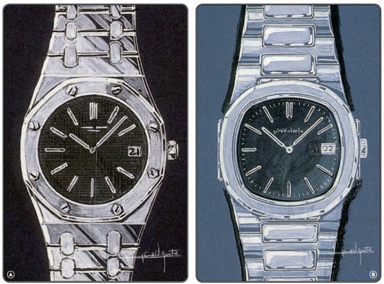
This year marks the 40th anniversary of what I think is a pretty special watch. All the way back in 1972, Audemars Piguet had changed the world of horology with the introduction of the Royal Oak – a Gerald Genta designed watch that signalled the beginning of the luxury sports watch. It was inevitable that other brands would respond in similar vein, and sure enough Patek Philippe did so in 1976; interestingly, it was with another Genta design – the Nautilus 3700. Like the story behind Genta’s design for the Royal Oak, the Nautilus also provides some insight into the way this great man thought, designed as it was over a hotel dinner with the porthole of a transatlantic liner as his inspiration. He was aware of two PP executives sharing the restaurant with him at the time, and it took him all of five minutes to complete his first sketch before going over for a quiet word. Amazing.
The Nautilus 3700/1 had a patented case formed of a solid mono-bloc module into which the movement was inserted. Sitting on top of that module was the now iconic octagonal bezel, with brushed and polished faceted surfaces. The case had two “ears”, reminiscent of the hinges of a porthole, and was finished off with an integrated bracelet, as could also be found on the Royal Oak. The dark dial was embossed with horizontal lines, with gold baton indexes. Inside the 42mm case (no wallflower for the time, hence the “Jumbo” nickname) was a Jaeger-LeCoultre ultra-thin movement, calibre 920, named calibre 28-255 C by Patek (a movement shared by the RO 5402 and the Vacheron Constantin calibre 222). Even if the watch was large for 1976 standards it was quite subtle on the wrist, thanks to a 7.6mm thickness. After that, the Nautilus range evolved with the addition of ladies versions, smaller editions (ref. 3800) and later complications including date, power reserve, moonphase, chronograph, etc.

And here’s Genta’s two sketches, side by side – amazing, really, when you think about what the future held for both brands as a consequence of these design icons…
Now, I’m going to fast-forward to 2006, because that was the year that the 5711 was released as a very faithful hommage to the original Genta masterpiece. In fact, whilst there are many differences the really striking thing is how similar the two watches look…
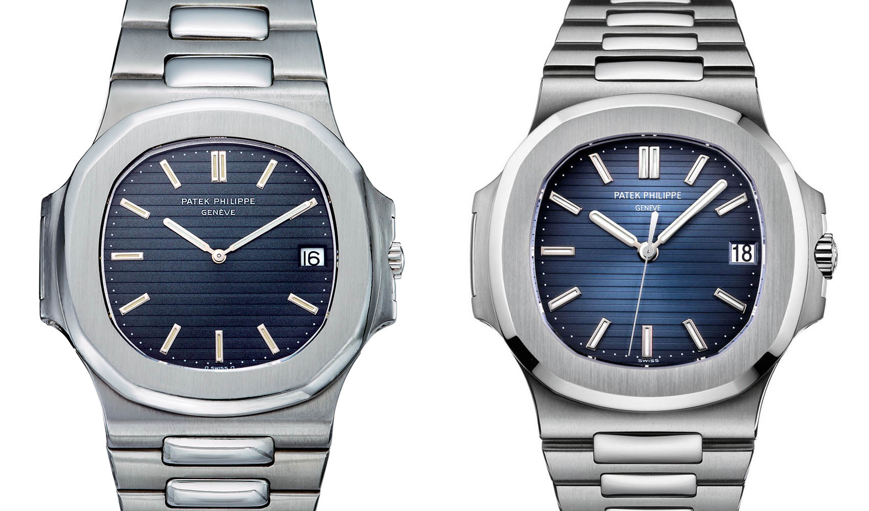
All of the basics are still there: stainless steel octagonal case, two lateral hinges, an integrated bracelet, a mix of brushed and polished surfaces, a simple display on a grooved blue dial… however, you can also spot differences.
I’m going to stop there, because to start talking about the various models under the Nautilus banner would take far too long; suffice it to say that I like them a lot. In fact, I’ve been on the waiting list with one of the nicer ADs for some time, and a few weeks ago popped in to have a chat with the manageress, who’s absolutely lovely and always prepared to spend some time on customer relations! Anyway, she asked me why I wanted a Nautilus, and I left the shop half an hour later feeling that I’d done my chances of snagging one of these beasts no harm at all. Then, two days later, she called me to say that – whilst she couldn’t offer me the blue dial – she had a while dial that the intended owner was unable to complete on. Apparently our conversation had elevated me up the list, and later that day I was sitting inside the shop, drinking a glass of champagne and confirming that the seal on the packaging should be broken.
I have to be honest and say that, at that moment, I felt both excitement and disappointment; excitement that the timing happened to have worked for me (meaning that I could say yes to the offer of the white dial), and disappointment that it wasn’t blue. I’m still on the list for the blue dial, but I have to say that after a month and a half of ownership I may just prefer the white. In any event, I’ve rejected the offer of a dial swap (for now!), and will just enjoy wearing it and see what the future holds. It really is a sublime watch, and whilst I never intended (or thought I’d be able to afford) to own two PPs, I really think of them as the best of both worlds; and absolute joy to own and wear, and a rock-solid investment for my retirement.


And a wrist shot…

