So there I was…

…Sitting at home the other night giving myself a pat on the back for finally getting down to my target of 6 watches (not bad, considering I’d been on 17 just a few months ago). Anyway, I got to thinking about the ones I missed – not that high a proportion, considering I’ve flipped so many – and one of those that sprung to mind was my old Speedy “Grail”.

Now, I missed it partly for the lovely watch that it was but also because inside was the veritable Lemania 5100 movement, which in itself is more than a little interesting. It was the successor to the 1340/1341, which had been in production since 1972 or thereabouts, and was developed in order to provide a cost-effective alternative to the cheap quartz movements that were flooding the market at the time. The 5100 wasn’t innovative in any way (in fact, it’s considered somewhat antiquated) and it was actually made with one or two nylon parts – for example, the clutch wheel – as well as iron bearings in place of certain jewels that would otherwise have been used.

It was quite simply a rugged workhorse of a movement, but whilst it gained respect for that, the main reason that it has become so lauded over the years is because it offers a different and rather brilliant take on the chronograph functionality. Underneath the main chronograph hand is another (aeroplane-tipped) hand that actually traverses the dial counting off elapsed minutes; this is much easier to read than a sub-dial, and it means that there is only one chronograph-related sub-dial, that being the elapsed hours (at 6). At 9 is the sub-seconds and at 12 is a 24-hour register. Very different, very useful and very readable.

So, back to the other night, then, and I started off thinking about the Speedy and its movement. That got me thinking about the Ed White in my collection at the moment, with it’s rich history and heritage in terms of the space programme. And that’s when I had an epiphany, because I was bloody sure I recalled that there was also a Sinn that was used during the early years of the space programme, and which also used the L5100 movement. A few minutes of research, and I had identified the watch concerned – the Sinn 142.

This is actually an interesting watch. It was once thought to have been the first automatic chronograph in space, and indeed subsequent case backs were so engraved. However, that honour actually went to the Seiko “Pogue” 6139-6002, which spent a few months on the wrist of Colonel William Pogue aboard Skylab 4 in 1973. (Incidentally, although a lot of people believe that the L5100 was first used in 1978, from what I can gather it was actually developed for Omega in 1973, and used in the Speedmaster from the following year.)

Anyway, the Sinn 142 was worn – as the second automatic chronograph in space – by Reinhard Furrer aboard the Space Shuttle Challenger in 1985. Mission STS 61-a (also known as D1… remember that) was the 22[SUP]nd[/SUP] space shuttle mission, and was the last successful mission of the Challenger, which was destroyed during mission STS-51-L in 1986. STS-61-A currently holds the record for the largest crew, eight people, aboard any single spacecraft for the entire period from launch to landing.

So, those were the sparks in terms of both the movement and the watch that prompted me to post a “Want To Buy” ad the other day for a L5100-powered Sinn 142. No sooner had I posted it, than I had a message from a friend of mine saying that he’d actually just listed one for sale. Within minutes a deal had been done and a couple of days ago the watch landed on the doormat (well, I opened the door to the postman and carefully relieved him of the package). There are a few interesting things about this watch too.

Firstly, it carries the number 1420008 on the caseback. Bearing in mind the caseback is engraved with the D1 mission logo it doesn’t seem possible that it can be one of the earliest examples as this engraving only occurred after 1985 for obvious reasons; it also has the newer dial variant. Anyway, I’m waiting for Sinn to clarify the meaning of that number and hopefully all will be revealed shortly. The other interesting thing (but only for me, I imagine) is that it’s not mint, and shows very obvious signs that it’s been used as intended over the years. I’m currently trying to wean myself off only perfect and mark-free examples of older watches in order that I can wear them without worrying about them all the time. It remains to be seen whether or not I’m successful 🙂

Return of the 5513

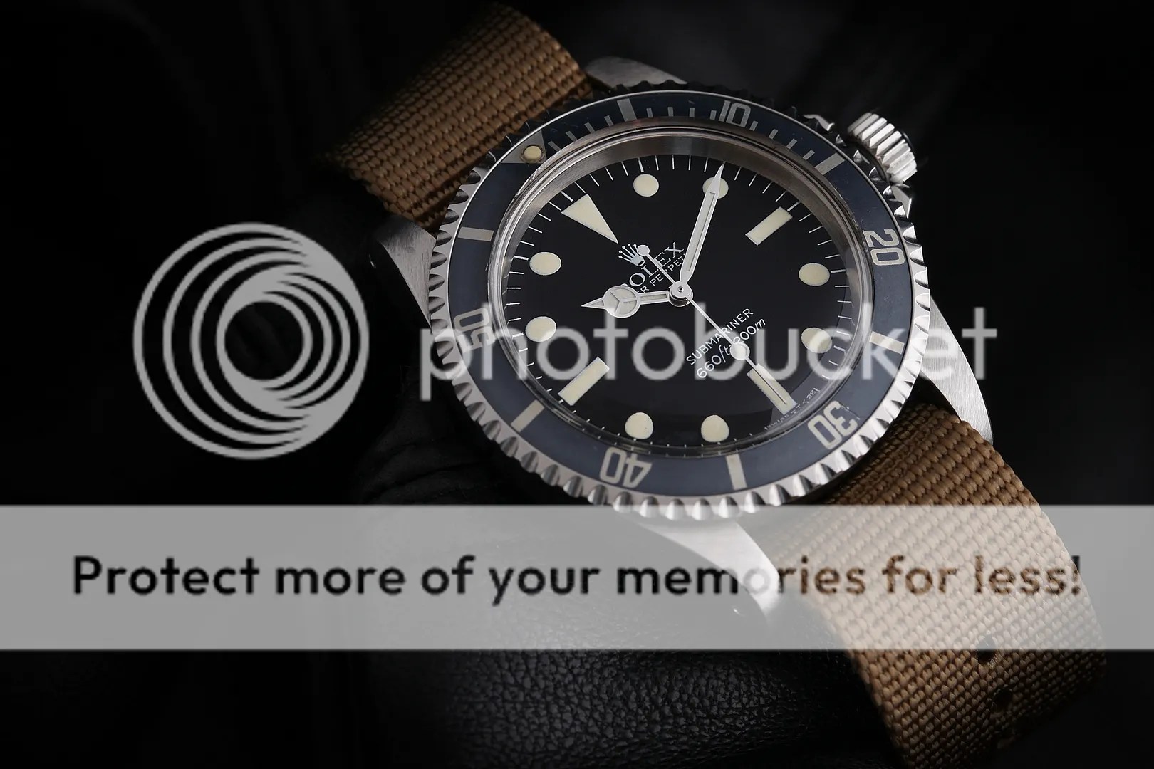
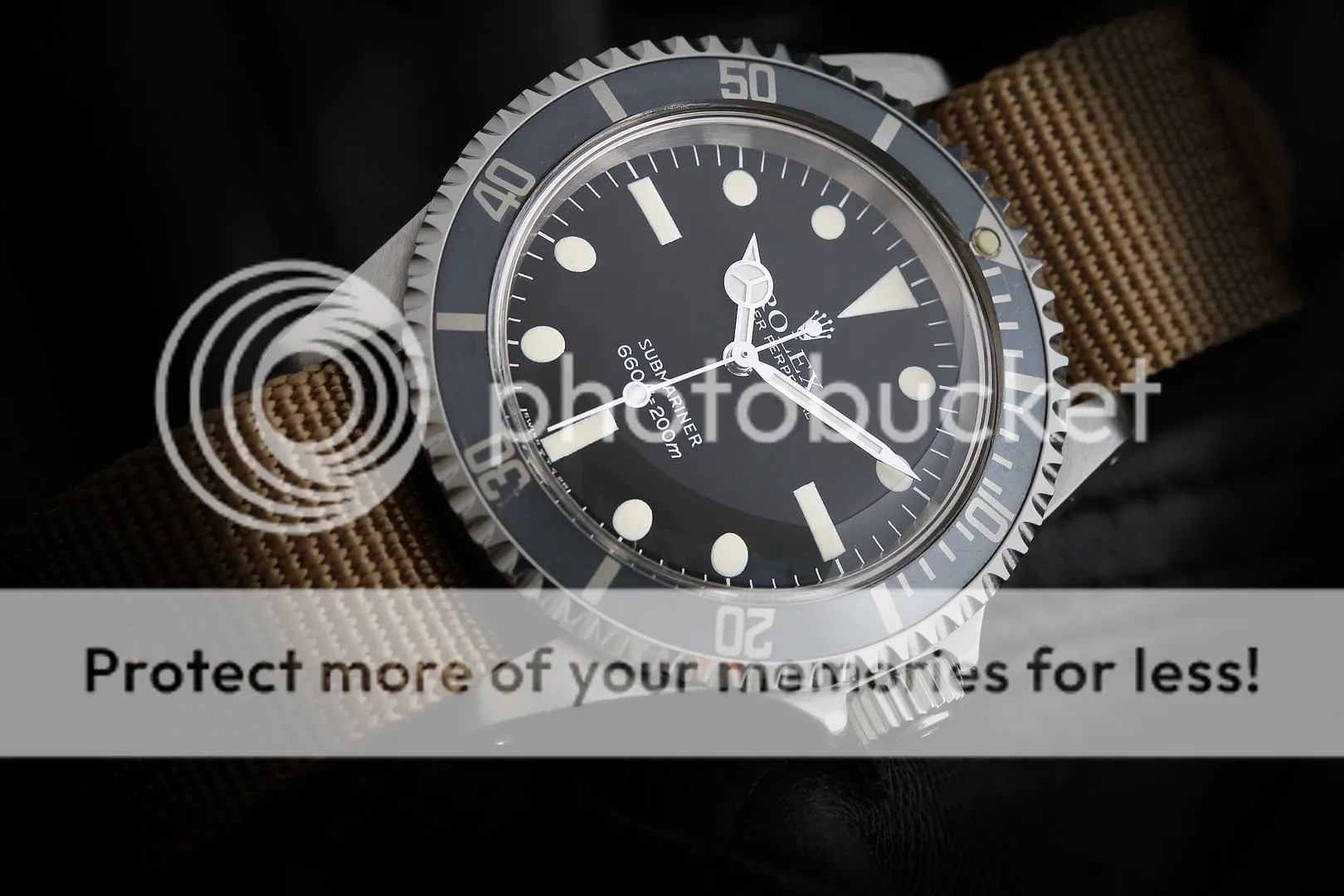
Not too long ago I was rejoicing the absence of divers in my now relatively small collection, having just moved on my second Great White in favour of a white gold Zenith Daytona. In fact, in the past I’ve had two of those beauties as well as two of the nicest 5513s that I’ve ever seen, not to mention a near perfect 1680. I suppose I’ve enjoyed something of a love affair with vintage Rolex divers and for some reason I’d decided that it needed to come to an end; in part, I suspect it was because I was a bit uncomfortable having so much money invested in a tool watch (at least, so far as the 1665s were concerned) which then made me worried about wearing them in all but the safest environments.

Anyway the upshot was that I tried to buy back my last 5513, unsuccessfully it transpired, and then set my sights on finding another really good example. At the same time, a TZ-UK member with whom I’d dealt before dropped me an email asking if I’d be prepared to let him have the Daytona and suggesting that I might want – you’ve guessed it – his 5513 in part trade. Well, a long exchange of emails transpired, but finally we got to the position where a deal could be done; yesterday, after a long wait, my 5513 arrived.

This watch dates from 1981, and benefits from a NOS Tropic 19 Superdome crystal as well as a period-correct NOS 93150 bracelet. The dial is perfect, with gorgeous lemon-coloured plots and the hands are absolutely free of any corrosion (the flash makes them look a little bit lighter than the plots but in reality they’re a perfect match in terms of colour). It’s actually a Mark IV maxi dial, for anyone interested. Aside from the serial range being a pointer it’s recognisable by the sans serif font, the size and position of the plots and the relative positioning of the bottom text (and specifically the “=” symbol). It also has a beautifully faded fat font insert, which whilst being a little early to be absolutely correct for the watch gives it an appearance that I think is quite sublime. Aside from that, it has a really fat case and lugs, which means I don’t have to worry too much if it picks up some marks and consequently needs a tart-up at some point in the future.

Anyway, I’ve now reverted to my two non-Rolex dressier watches in the JLC and the GO, and certainly won’t be making the error of moving the 5513 on again in the future. If once is careless and twice is foolhardy, three times would be downright stupidity.

My 2nd Cartier

I have a lot of respect for Cartier as a manufacturer of watches, and some may remember a post I wrote in November 2012 after I bought a Tank Basculante, in which I made those feelings clear. That was a gorgeous watch but proved to be a tad small for me, and ultimately it had to make way for a Reverso that I’ve been enjoying for many months now.

Anyway, I’ve been looking at the Santos for some time as a possible replacement, and yesterday I was offered one in mint condition and at a good price so decided to give it a go. I’m very impressed actually, as the quality and finish are superb. It’s the 100 XL, and whilst a large watch the curved case and relatively short lugs mean that it sits perfectly on my 6.75″ wrist. In fact, the case without the lugs and crown guards only seems to measure about 38mm square, which is slightly smaller than the 41mm quoted on the net (either way, it’s nowhere near as big as I thought it would be). The movement is an ETA base, the dial a traditional Cartier Roman numeral non-date, and the mix of polished and brushed surfaces gives it an appearance that’s both sporty and dressy.

Was the Santos the first ever wristwatch? Possibly – it’s a bloody good story anyway, though!

A lesson in vintage

These two watches have taught me a very important lesson when it comes to vintage, and one that has altered my whole perception of what I like. I’ve spent the last couple of years looking for old watches that are so pristine that they might never have been worn, but throughout that time I’ve been missing the point.

I love these watches so much, and part of the reason is that wearing them feels like I’ve inherited their history – because you can see that history at a glance. In fact, this has struck home to such an extent that I’ll almost certainly move on my NOS Autavia GMT and replace it with something that looks… well, a bit older.

Funny game, this.

This took me back

A while ago I was asked to take some shots for a jewellery website that’s under construction. The jewellery is bespoke and beautiful, and the designer actually made Bea’s engagement ring as well as our wedding bands.

Anyway, it had been a while since I’d shot any serious photos (although I’d never done anything like this before), and matters were complicated by the fact that when the lights that had been hired for me were unusable; I therefore had to shoot everything with natural light only, balanced on some precariously broken steps outside the French windows. Still, I was quite pleased with how they came out, bearing in mind I had to put up with shallow depths of field and shutter speeds that were in reality a little too slow!

Those bloody Seikos…

I wrote some time ago about my addiction to old Seiko divers – particularly the 6309 – and as if to prove the poijt I’ve just bought back the actual watch featured in that post. It’s a 1979 6309-7049 (the latter numbers signifying that it was built for the US market) and it’s a peach.

I really must try to hang onto it this time 🙂

4th time lucky

Based on an over thirty year-old design, the Marine Master 300 (model reference SBDX001) is like taking a step back in Seiko history. The quality is supreme, starting with the monocoque case, heavy but comfortable. The movement is a 26 jewelled, 28,800 bph 8L35, an undecorated and unadjusted version of the high-end Grand Seiko 9S55. The dial is a rich and gorgeous matt black, with applied silver indices and Seiko’s magnificent Lumibrite fill on markers and hands.

This one is my 4th, and I’ve bought it again (for the last time) because I genuinely think it’s the best bulletproof, everyday watch that you can get for the money. The only fly in the ointment is that they still need to go back to Japan for servicing (although that situation may be changing any time now).

One of my all-time favourites

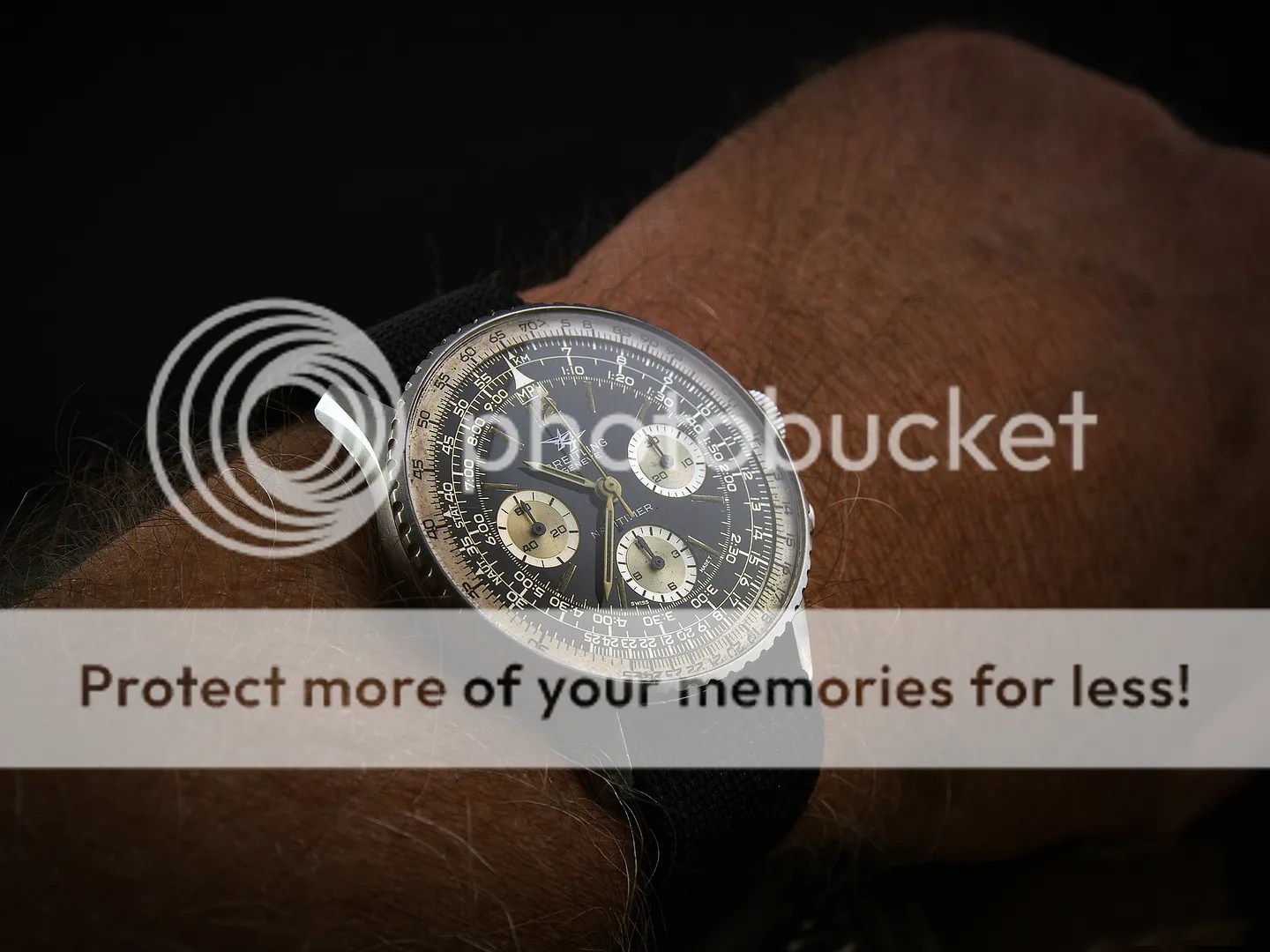
I’m not quite sure what it is about the 806 Navitimer. This is my second – once again housing a Venus 178 movement and showing far more patina than the first (but all the better for it); when on the wrist, it just has a delicious golden glow that hints at its 47 years of age.

I could honestly wear this every day and never get bored, and I don’t see myself ever selling it. A perfect watch, and one of my all-time favourites.

Dot over 90

I met a few fellow watch-enthusiasts for a (rained-out) BBQ over the weekend. Someone had kindly offered to bring a press in order that the old/original “dot over 90” bezel could be put back onto my Ed White Speedy and I thought it was too good an opportunity to pass up. Off came the service replacement and on went a rather worn, scuffed but authentic bezel in its place.

I do tend to like my watches as minty as possible, but for some reason this looks so much better.

Iconic chronographs

I’ve seen quite a few attempts to define the most iconic chronographs of all time. Top 5 after top 5, all of which have one thing in common… and that’s the watches that occupy the first 3 places. I didn’t set out to have those 3 in my watch box, but I’m not complaining either.

I have to admit, after these three it all gets a bit confusing. I think I’d go for a Heuer of some sort – probably a Monaco, put perhaps a Carrera – in 4th spot?

And then there were none…

I was chatting to a friend the other day, saying that I really seem to have “grown out” of divers. I don’t mean that in a condescending way, and there are some beautiful dive watches around, both old and new (and both Rolex and non-Rolex). Without meaning to, though, I seem to have slowly divested myself of them, and my other sports-style watches, in favour of alternatives that are a bit more dressy, or a bit more complicated. For me, this appears also to mean a bit more interesting.

I won’t dwell on those that have gone (there were many) or why I bought them (they were all beautiful, and most had some kind or heritage or, indeed, a status bordering on iconic). The last diver I had was a genuinely stunning Great White, but in the end I allowed it to go the way of the others. I know that many people will think that I’m completely bonkers, but there’s no point building a small collection of watches based on the views of other people. What works for me these days is a little different, and I’d like to think that – in ploughing my own furrow to some extent – I’ve also broadened my horizons a bit. Anyway, onto… the Daytona!

This is a watch that I’ve tried before, both times the modern variant in stainless steel and with a black dial. I was sadly underwhelmed on each occasion, though, and there were a few reasons why. Firstly, the silver on black dial layout was a bit bland to my eye; in certain light it was difficult to read, and the subdials tended to get “lost” such that nothing stood out particularly vividly. Secondly, they wear surprisingly small on the wrist; you’d think the opposite would be the case but they’re pretty slim/flat and seem to have a look and feel that suggests a size less than their 40mm. Finally, I couldn’t help feeling that the Zenith Daytona was the one to go for (well, if one ignores the earlier Valjoux 72 for obvious reasons). I know that the 4130 movement is a masterpiece in its own right, and that the Zenith calibre 400 was heavily modified. In fact, the changes effected by Rolex included some fairly major stuff. For example:
– A new escapement with a much larger, freely sprung balance and balance spring with Breguet overcoil – a preferred, and more costly configuration that leads to higher accuracy.
– A reduction in the balance’s oscillation rate from a speedy 36,000 bph to a more relaxed 28,800 bph – theoretically at least requiring less frequent service.
– Elimination of the date function.

In all, I think I’m right in saying that more than 50% of the individual movement parts were changed/upgraded in some way, so the final product was pretty different to the movement Zenith originally manufactured all the way back in 1969. When all’s said and done, however, I personally find the attraction of the Zenith Daytona outweighs any arguments in favour of the alternative. I’m quirky like that 🙂

Anyway, the history of the Daytona is a complicated one that goes back to 1965, when the name was used on the Cosmograph for the first time (it’s roots go further back than that, in fact). To try to address that history here would no doubt bore the socks off everyone but there’s plenty of info on the Net (and some good stuff over at Jakes Rolex World and Hodinkee amongst other places).

The one that’s sitting on my wrist at the moment is a white gold 16519 that dates back to 1998. The use of gold, as opposed to stainless steel, transforms the watch into an altogether different beast; the heft, the hue of the gold… both give it a wrist presence that I missed in the SS versions that I previously owned. The biggest difference is on the dial, though; it really does pop, and the appearance changes in different light and at different angles to an extent that’s hard to believe. Hopefully, I’ve demonstrated that to some extent in the photos below.

So, do I miss my divers? Errrr, no – not right now, I don’t!

Shell cordovan

This Autavia GMT is almost too perfect to wear… in fact, I hadn’t worn it for a while before I bought a new shell cordovan strap for it from DB10. Now, it would be rude not to.

Sometimes…

You just have to leave the dial alone!

The definition of “icon”

Icon: a person or thing regarded as a representative symbol or as worthy of veneration (Oxford English Dictionary)

I find the general love of all things Breitling a bit mystifying, if I’m honest. Whilst I don’t doubt their quality for a moment, I really haven’t seen many that I like and most are simply far too blingy for an old fart/traditionalist like me. That said, there has always been one exception, and that’s the Navitimer. Within the iconic watch hierarchy I believe it holds a place very near the top, and some time ago I allowed a rather lovely example to slip through my fingers. yesterday, however, I put that right.

The Navitimer has a genuinely interesting heritage and history. After the great success of Breitling’s first slide-rule watch (the Chronomat), the Navitimer was launched all the way back in 1952. Whilst the Chronomat was focussed on the engineer and businessman market, the Navitimer was designed specifically for pilots; so much so that the “Aircraft Owners and Pilot Association” (AOPA) immediately decided to make it their official watch. This new Navitimer combined three essential tools for navigation – a watch, a chronograph and a slide-rule. It was, effectively, a navigation timer, hence the name it was given.

The Navitimer was designed with the Venus 178 movement (although some later models contained a Valjoux), a well-respected column wheel chronograph, and the first to be produced were fitted with a black Arabic dial and the famous AOPA logo. In fact, on the very first models “Breitling” was only seen on the case back. Shortly afterwards, the Breitling name was added over the AOPA logo, sometimes topped with the “B”. The reference of this watch was 806, and remained so until the introduction of a completely new generation in the 1970’s.

Over the following years, there were a number of dial variations, each termed a “Generation” (numbered 1-7 or so up to the 70’s, at least); there are some reasonably good sources of information out there for anyone who may be interested, but it takes a bit of legwork and it can be a little confusing as not all historic accounts are completely consistent.

Anyway, this acquisition is lovely – a 2nd Generation 806 that dates to 1966. It really is in good all-original condition, with a white on black dial and incorporating the earlier/smaller subdials that I think are by far the nicer. Aside from the fact that the case is largely unmarked, the patina on dial and hands is even and dark, and the subdials are gorgeous (it was very recently serviced, but a decision was made at the time not to attempt to clean the dial – there are obvious signs of discolouration, but on the plus side it means that it’s in untouched condition). Note the absence of red highlights too – seen on later/current models but unsubtle in comparison.

Just a little (more specific) information on the 2nd Generation variant, taken from the Net:

In approximately 1960 – after the watch had already become a huge success – the Navitimer’s design was modified and thereafter became known as “2nd generation”. The three subdials changed from black to white, the hands were remodelled and the Breitling name appeared in printing on the dial. During the 1960’s the slide-rule bezel was also remodelled twice. Moreover, the AOPA wing was removed from the dial and the official Breitling Navitimer logo became two aircrafts flying in close formation. At the same time, however, Breitling continued to supply AOPA with Navitimers sporting the AOPA logo on the dial.

It was quite hard to glean much data on the Venus 178, but I did find this:

Lever movement, stem wind, seconds bit with second hand, column wheel chronograph with carrying arm, 1/5 second, 30-minute register and hour counter. Diameter 31mm, 18.000 BPH, 17 jewels, Incabloc shock protection.

So, a few photos then…